Climate extremes: heatwaves, changes in ice and drought visualisations#
Animations can be used to great effect to enhance visualisations and are particularly popular in newer social media contexts that favour video formats.
Indices can simplify visualisations to give viewers a more relative understanding of a phenomena and its impacts.

Visualising marine heat waves (Credit: marineheatwaves.org).#
Divergent colour scales can be useful for visualising trends and anomalies.

Visualising sea level trends (Credit: Copernicus Marine and Climate Change Services).#
Video based formats offer an excellent way to combine static images, animations and narration to explain complex topics.
Satellite products can provide broad perspectives on the impacts of events, such as in this example, where the impacts of floods on land are caputred further in their impacts on the coastal marine environment. These can be particular powerful to bring a sense of scale to images on the ground such as those shown in the video below.
Rapid and clear visualisation of core information is essential for disaster response.
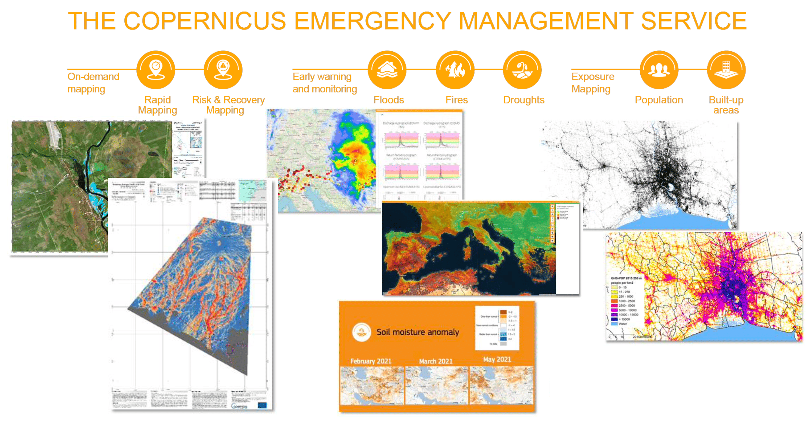
View options for the Copernicus Emergency Management Service (CEMS) (Credit: Copernicus Emergency Management Service).#
It is particularly important to provide long-term context for events being reported in the present. Growing numbers of climate quality data records can be used for this.
