Oceans and sea ice visualisations#
Satellite data can reveal underlying physics, beautiful painting-like patterns, and risks to humans (such as those from some types of algal blooms).
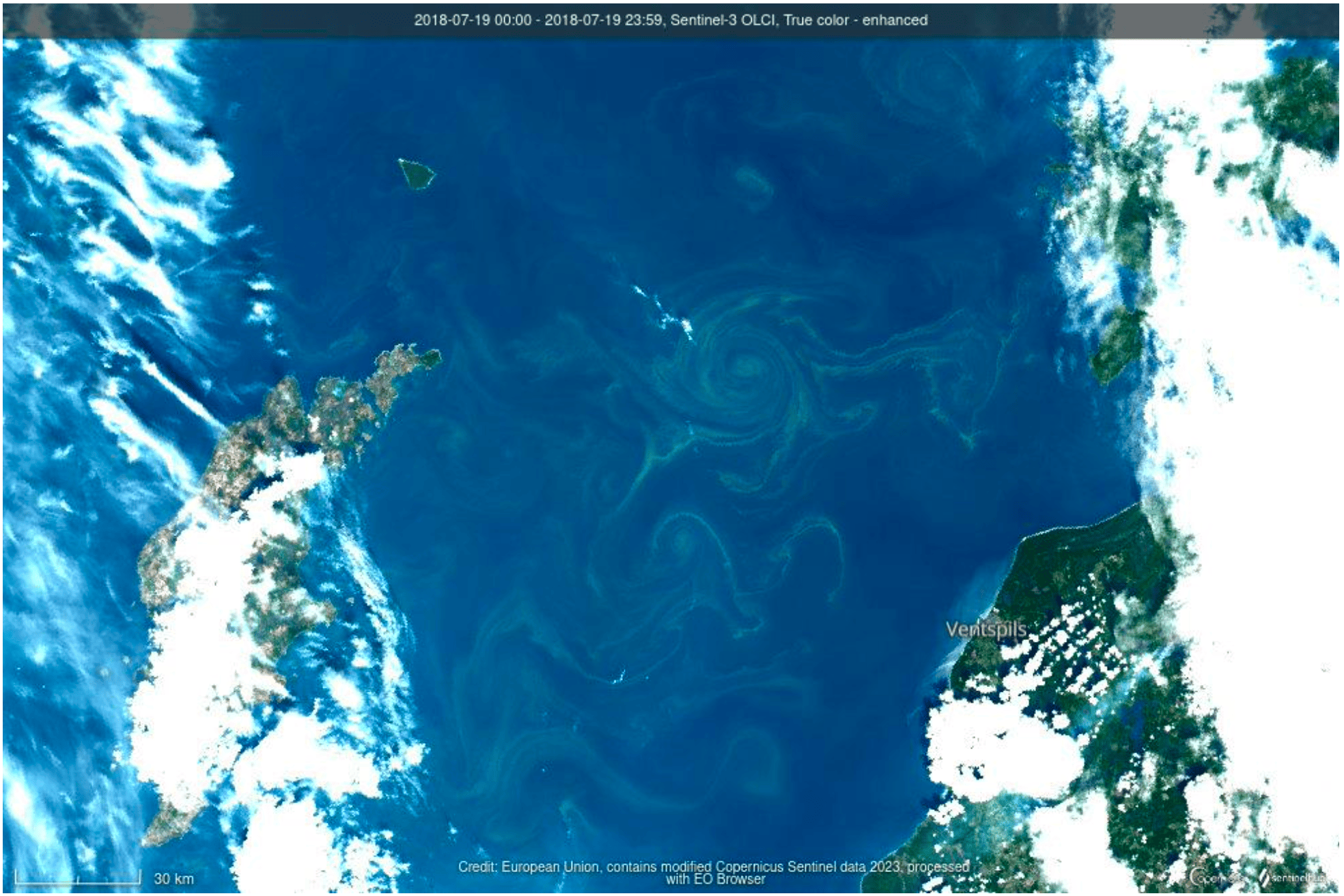
Algal blooms caught in an eddy (Credit: Aida Alvera-Azcárate and Sentinel-Hub).#
Whilst providing information is a core aim of most EO visualisation, artistic and creative approaches can also be inspiring.
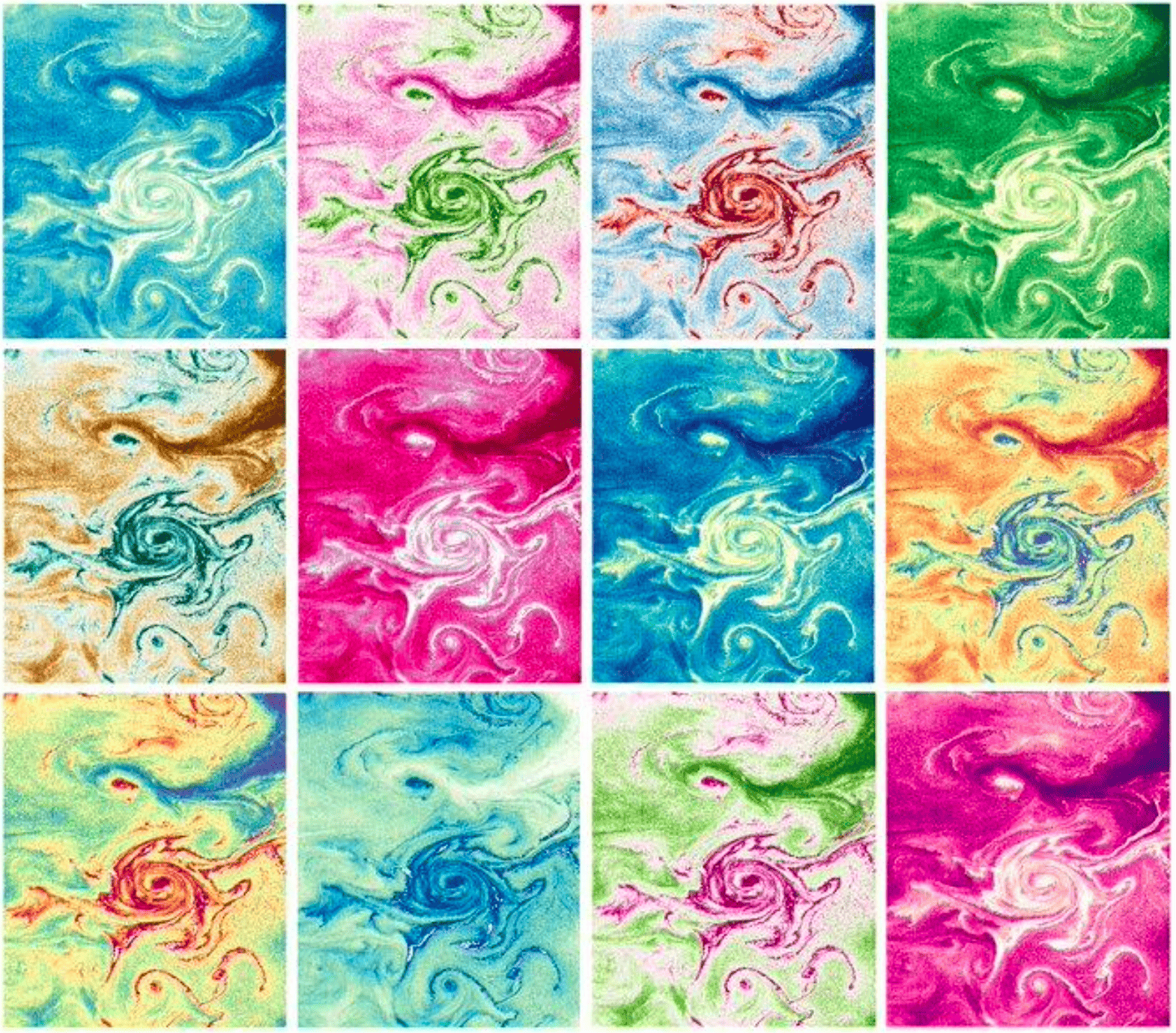
Viewing ocean colour signals with different palettes (Credit: Aida Alvera-Azcárate).#
Combining EO data sources can be useful when explaining phenomena.
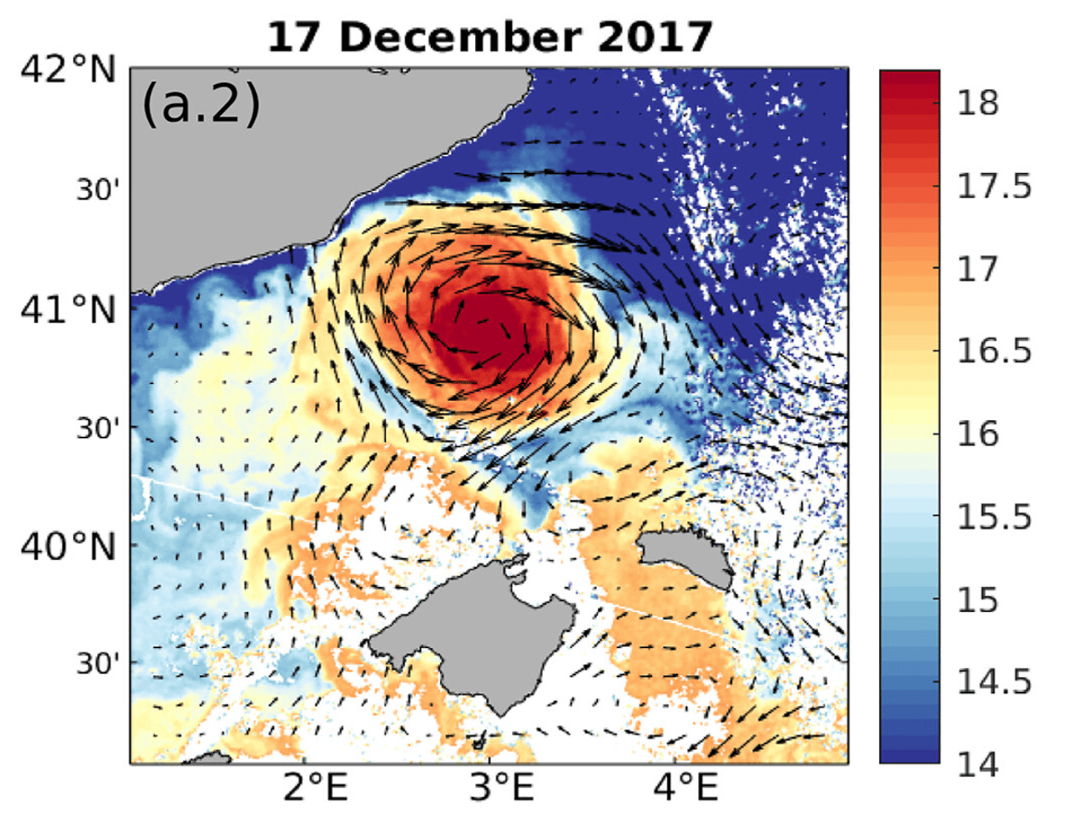
Eddy dynamics in the Balearic Sea (Credit: JGR Oceans;Wiley).#
Visualisation platforms such as MyOcean can allow for rapid exploration and visualisation of data.
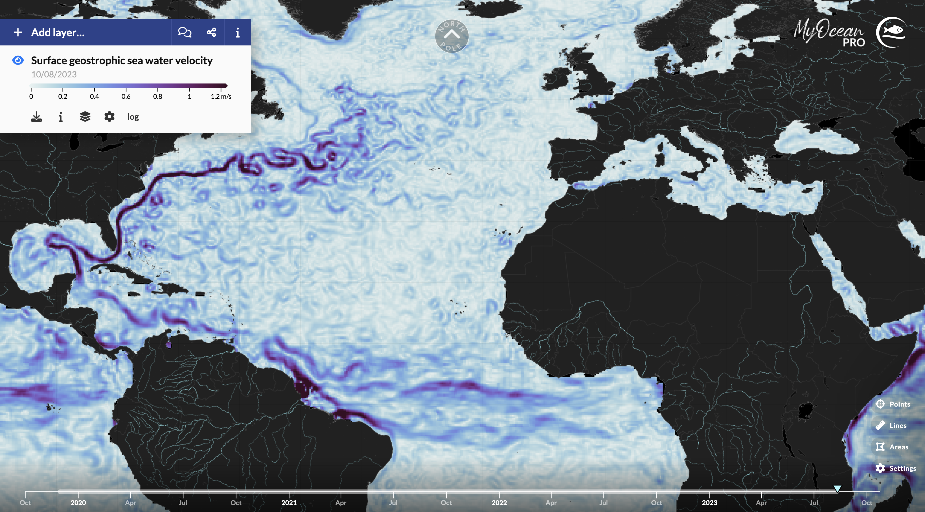
Surface geostrophic velocity product in Arctic and Antarctic sea ice coverage since 1980 (Credit: Copernicus Marine Service).#
Many datasets contain variables offering different perspectives on a domain, and can be presented in different ways to provide a more complete picture of a situation.

Sea ice coverage in the Barents Sea (Credit: OSI SAF and Copernicus Climate Change Service).#
Visible imagery from Sentinel-2 highlighted reported changes in Venice during a COVID-19 lockdown. This initial investigated evolved in to a full scientific study.
Clear labelling, and annotation can help make visualisations much more understandable. Including links to sources can help viewers recognise legitimate data sources.
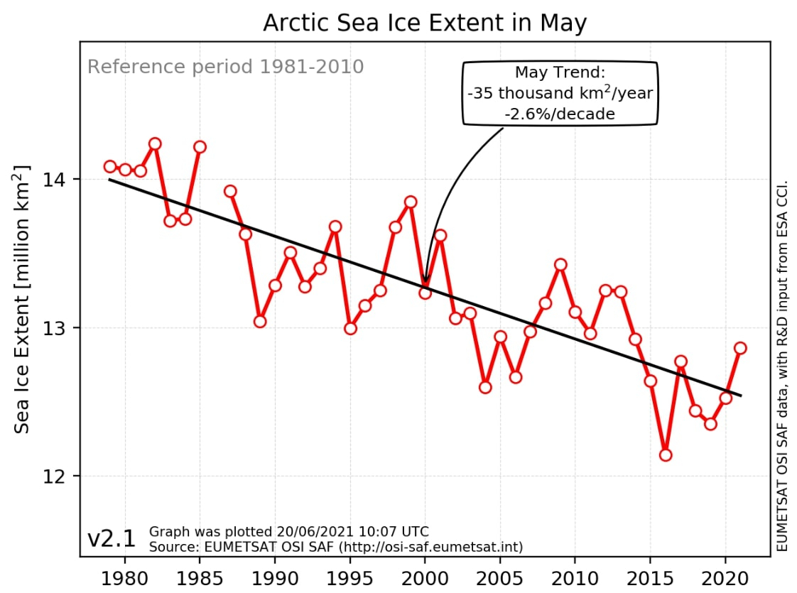
Annual change in Arctic sea ice coverage in May since 1980 (Credit: Associated Free Press and EUMETSAT OSI SAF).#
More and more news sites are providing visualisations via their own dashboards. Comparing multiple data sources can help communicate the reliability of key conclusions in stories told with EO data.
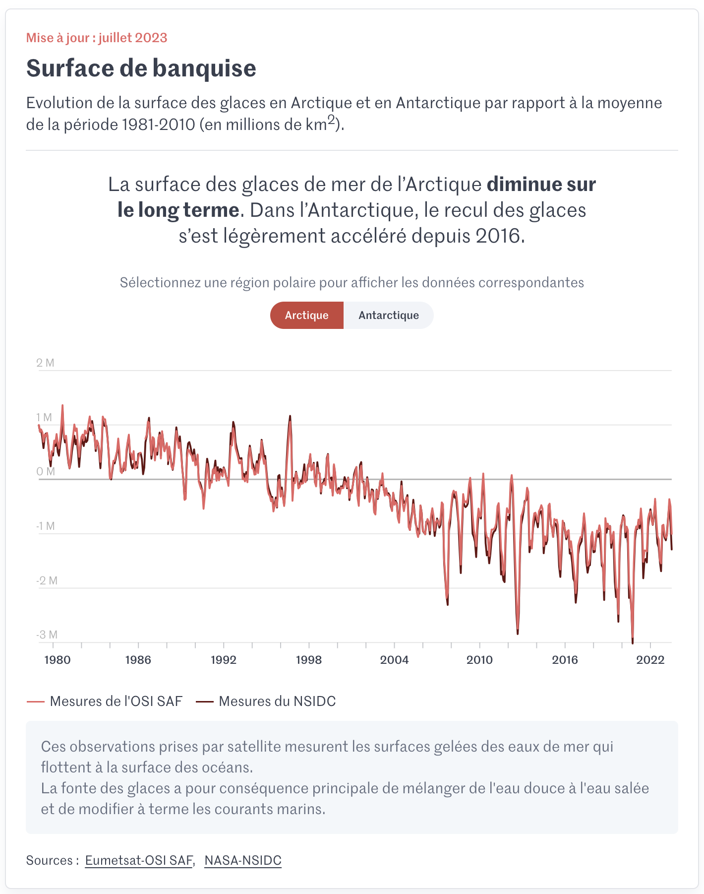
Change in Arctic and Antarctic sea ice coverage since 1980 (Credit: Le Monde and EUMETSAT OSI SAF).#
EO data can be supplemented with other data sources towards a wide variety, of societally and environmentally valuable applications.

Satellite use in oil spill tracking (Credit: Orbital EOS and CMCC).#
