Climate and weather visualisations#
Even when not visualised itself, data can still inform story telling. Clear and concise statements can distill vast of amounts of data in to stories that anyone can understand.
Repeating visualisation can readily show signficant changes across a data set.
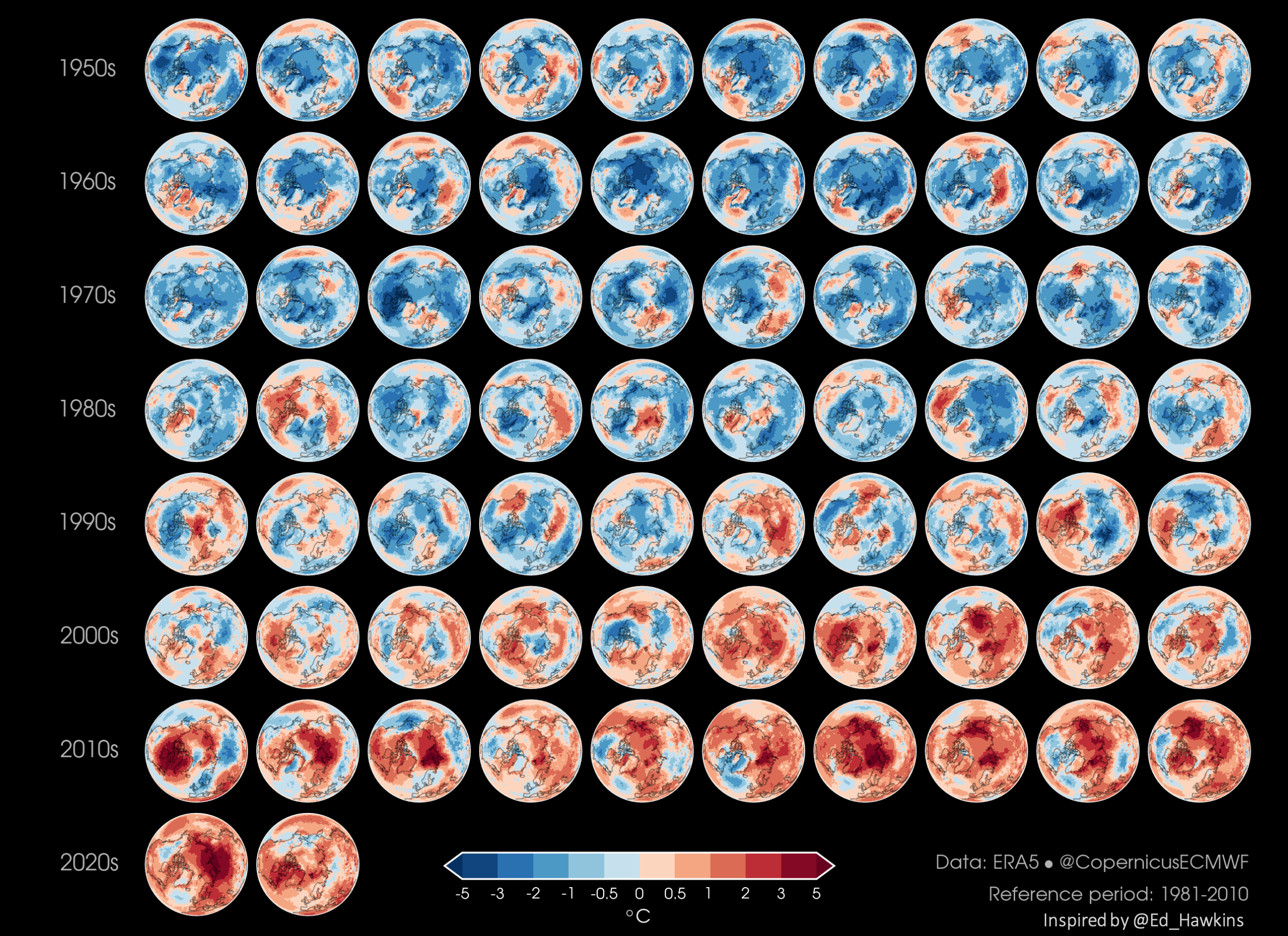
ERA5 annual mean temperature anomaly (Credit: Copernicus Climate Change Service).#
Visualisations have the potential to become memes, and can be repeated in many contexts.

Visualising climate stripes (Credit: University of Reading).#

The Pope discussing climate stripes (Credit: Cristina Nadotti @CriNadot)#
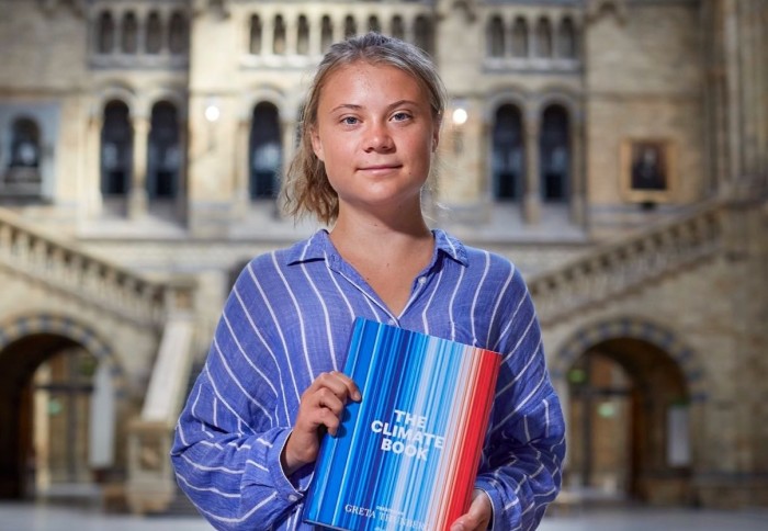
Greta Thunberg holding “The Climate Book” (Credit: Imperial College London)#
Providing comparisons that people can readily understand, can greatly aid visualisation.

Glacial ice loss in the alps in 2022 (Credit: Copernicus Climate Change Service).#
Clear comparisons, with use of consisistent style, labelling, and data baselines, can tell stories of change, and refute inaccurate claims.
